

Learn how Siteplay.ai workflows map directly to the exported code structure, sections, pages, sites, and design systems.
Siteplay.ai is designed around a simple concept:
Everything you create visually inside the platform directly maps to clean, structured frontend code.
The Core Building Blocks
Section titled “The Core Building Blocks”Siteplay.ai uses a hierarchical structure built around three major building blocks:
Section → Page → Site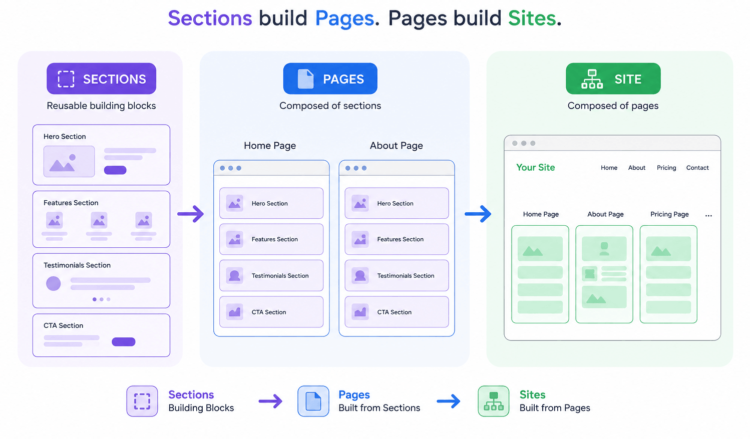
Understanding this hierarchy is important because the exported code follows the exact same structure.
This helps developers easily understand:
- How workflows generate code
- How pages are structured
- How sections map to components
- How design systems connect to stylesheets
- How exported projects are organized
The goal is to make the transition from visual workflows to developer workflows as seamless as possible.
Sections
Section titled “Sections”A Section is the smallest reusable building block in Siteplay.ai.
Sections are designed to be:
- Reusable
- Customizable
- Independent
- Drag-and-drop friendly
Inside the exported codebase, sections usually map directly to individual component files inside page folder.
src/ components/ home/ Hero.tsx Testimonial.tsx Feature.tsx Content.tsx pricing/ PricingTable.tsx global/ Navbar.tsx Footer.tsxGlobal sections are reused in the pages. This will help reduce duplicated components in the sites. eg: Navbar and Footer components are used in all the pages if configured in the visual editor.
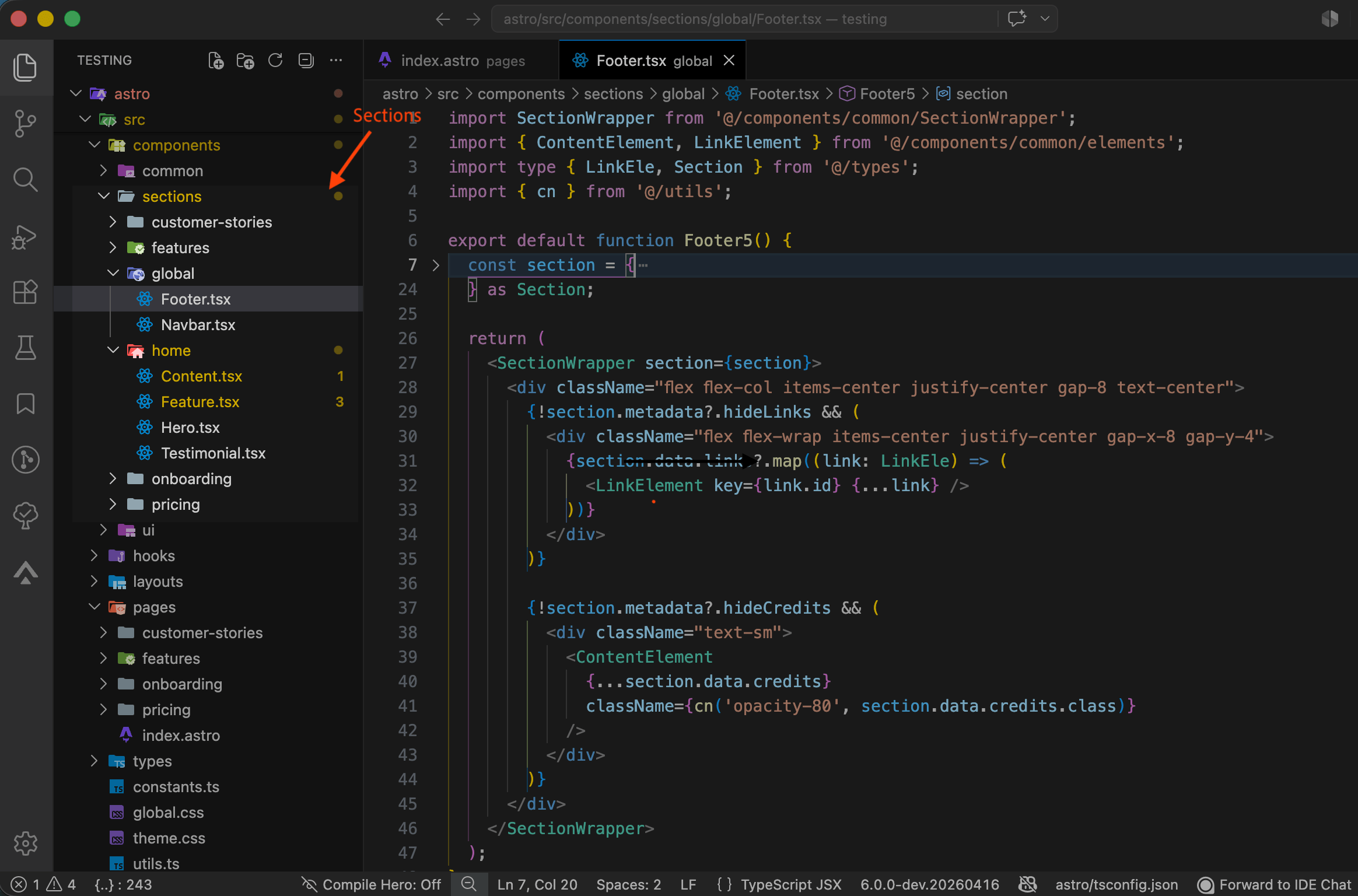
Each visual section in the editor corresponds to a real frontend component in the exported project.
A Page is a collection of sections arranged together to form a complete screen or route.
Inside Siteplay.ai workflows:
- Planning defines page structure
- Prototype workflow generates sections inside pages
- Design workflow styles the pages visually
In the exported codebase, pages map directly to route/page files depending on the framework.
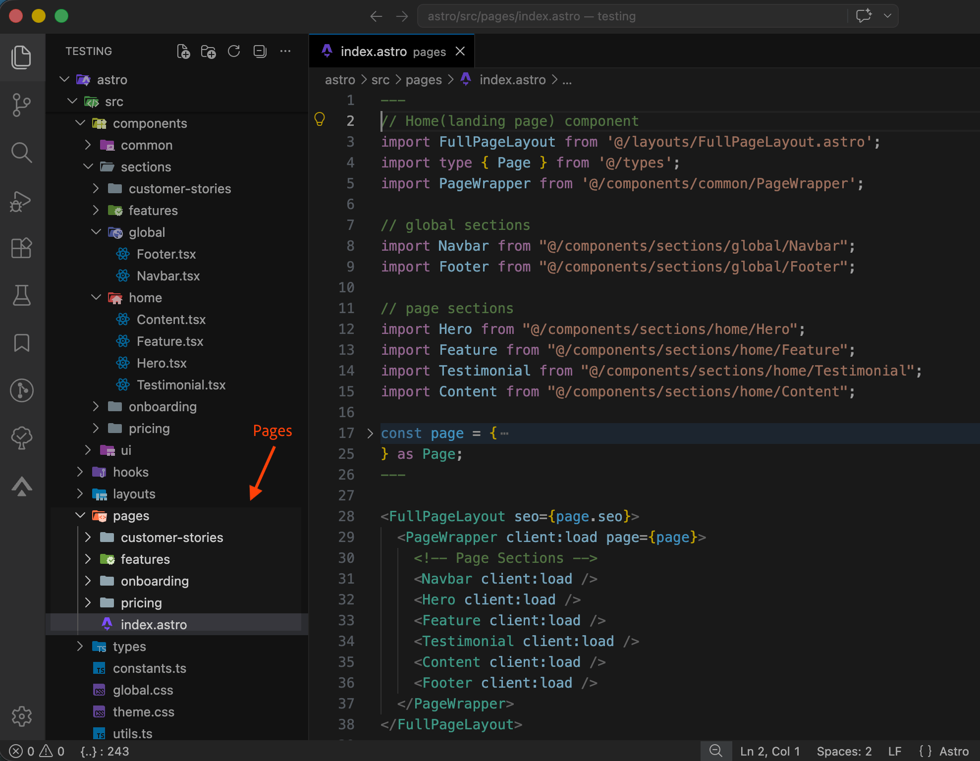
Each page imports and renders the sections configured inside Siteplay.ai.
This means the visual order inside the editor directly maps to the rendered code structure.
Common Elements
Section titled “Common Elements”Apart from sections and pages siteplay.ai also has common atomic elements that are used inside the sections. These elements are included in pages or sections and can be imported and used in the components directly. They are grouped under the components/common/elements folder.
Common elements include:
components/ common/ elements/ ButtonElement[.tsx|.vue] ImageElement[.tsx|.vue] TextElement[.tsx|.vue] ... PageWrapper[.tsx|.vue] ---> container component for pages ItemWrapper[.tsx|.vue] ---> container component for section items SectionWrapper[.tsx|.vue] -> container component for sections RenderBackground[.tsx|.vue] ToggleMode[.tsx|.vue] ...Design
Section titled “Design”The design workflow controls the visual appearance of the exported project.
Inside Siteplay.ai, design systems manage:
- Colors
- Typography
- Animations
- Button styles
- Card styles
- Image styles
These settings are exported into CSS variables and stylesheet files.
Styles
Section titled “Styles”@import "./theme.css";
@custom-variant dark (&:where(.dark, .dark *));
@config '../tailwind.config';
@plugin '@tailwindcss/typography';@plugin 'tailwindcss-animate';This allows developers to globally modify themes without changing individual components.
Typography & Theming
Section titled “Typography & Theming”Typography and theme settings usually map to global CSS styles and variables.
Color palettes are typically mapped into CSS variables. It uses shadcn/ui themes.
Example:
:root {  --primary: #6366f1;  --secondary: #0f172a;  --accent: #14b8a6;  --neutral: #f8fafc;  ...}
.dark {  --primary: #0d10c8ff;  --secondary: #0f172a;  --accent: #14b8a6;  --neutral: #000000ff;  ...}
body {  font-family: Inter, sans-serif;  ...}
h1,h2,h3 {  font-weight: 700;  ...}
This ensures consistent styling across the entire project.
Shared UI Styles
Section titled “Shared UI Styles”Buttons, cards, and image styles are mapped to reusable utility classes.
Checkout contants.ts file. Element styles are exported as DEFAULT_CLASSES
export const DEFAULT_CLASSES = { button: { borderCls: "rounded-md" }, img: { borderCls: "rounded-lg" }, card: { borderCls: "rounded-lg border-2 border-2", shadowCls: "shadow-none", },};// more codeAnimations
Section titled “Animations”Siteplay uses motion for Animations. The defaults are exported from the
contants.ts file.
export const SITE_ANIMATION = { section: { enabled: false } };
export const DEFAULT_ANIMATION = {  enabled: false,  preset: "slide",  offset: 20,  direction: "up",  duration: 0.4,  delay: 0,  ease: "linear",  opacityStart: 0,  scale: 1,  rotate: 0,  rotateX: 0,  rotateY: 0,};export const ANIMATION_PRESETS = {  slide: {    enabled: true,    offset: 40,    direction: "up",    duration: 0.4,    delay: 0,    ease: "linear",    opacityStart: 1,    blur: 0,  },
  zoom: {    enabled: true,    offset: 0,    direction: "none",    duration: 0.45,    delay: 0,    ease: "linear",    scale: 0.85,    opacityStart: 0,    blur: 0,  }, ...};
This keeps the exported codebase scalable and maintainable.
Why This Structure Matters
Section titled “Why This Structure Matters”The Siteplay.ai hierarchy is intentionally aligned with modern frontend architecture.
This helps developers:
- Understand generated code faster
- Maintain projects easily
- Replace sections independently
- Scale websites cleanly
- Reuse components across projects
- Integrate custom business logic safely
Unlike traditional website builders, Siteplay.ai exports developer-friendly code that mirrors the visual workflows.
Recommended Developer Workflow
Section titled “Recommended Developer Workflow”A common developer workflow looks like this:
- Plan website structure
- Generate pages and sections
- Apply design systems
- Export the project
- Open the codebase
- Continue development manually
Since workflows map directly to folders and components, developers can quickly continue customization inside their preferred framework.