

Learn how to create and customize design systems in Siteplay.ai to style and preview your entire website.
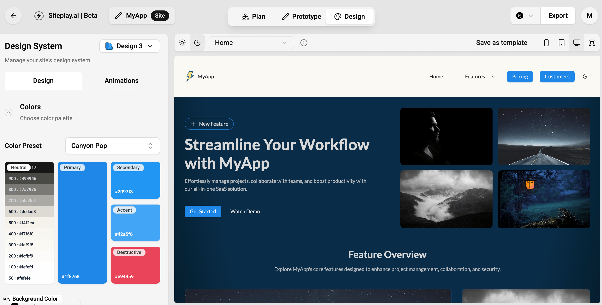
The design workflow in Siteplay.ai helps you transform structured website content into polished and consistent website designs.
After planning and prototyping your website, the design workflow allows you to:
- Create visual design systems
- Customize branding styles
- Apply themes across pages
- Preview the entire website
- Test responsiveness across devices
- Switch between Light/Dark modes in each design system.
Instead of manually styling every section individually, Siteplay.ai allows you to control the appearance of the entire website from centralized design settings.
Design System
Section titled “Design System”Siteplay.ai allows you to create up to 4 separate designs for a single website project.
This makes it easy to experiment with multiple visual directions without rebuilding layouts or rewriting content.
You can instantly switch between design systems and preview how the website looks with different styles applied.
Customize Color Palettes
Section titled “Customize Color Palettes”Each design system includes a customizable color palette.
You can configure:
- Primary colors
- Secondary colors
- Accent colors
- Destructive colors
- Neutral colors
These colors automatically apply across:
- Buttons
- Cards
- Sections
- Backgrounds
- Badges
- Text highlights
- Interactive elements
This helps maintain visual consistency throughout the entire website.
Typography
Section titled “Typography”Siteplay.ai provides typography customization controls to help define the visual personality of your website.
You can customize:
- Font families
- Font scales
- Heading styles
- Paragraph styles
- Text weights
- Line heights
- Spacing
Typography settings are automatically applied across all pages and sections.
This ensures a consistent reading and branding experience throughout the website.
Customize Component Styles
Section titled “Customize Component Styles”You can customize the appearance of reusable UI components across the website.
Supported style customizations include:
- Button styles
- Card styles
- Image styles
- Border radius
- Shadows
- Surface styles
- Section spacing
- Visual density
This allows you to create unique visual identities while keeping layouts reusable and scalable.
Animations
Section titled “Animations”Each design system can also include animation settings.
You can control:
- Scroll animations
- Transition styles
- Motion intensity
- Entrance animations
- Interactive feedback
Animations help improve user experience and make websites feel more dynamic and modern.
Preview Website
Section titled “Preview Website”The design workflow allows you to preview the complete website page-by-page.
This helps ensure design consistency across the full website before exporting code.
You can test your website across multiple screen sizes, including:
- Desktop
- Tablet
- Mobile
This helps ensure:
- Proper spacing
- Readable typography
- Responsive layouts
- Mobile-friendly navigation
- Consistent component behavior
Responsive previews allow you to catch layout issues before development or deployment.
Design Workflow Benefits
Section titled “Design Workflow Benefits”The design workflow helps teams:
- Maintain visual consistency
- Build scalable design systems
- Experiment with branding quickly
- Reduce repetitive styling work
- Improve responsive design quality
- Create production-ready interfaces faster
It is especially useful for:
- SaaS products
- Startup websites
- Marketing websites
- Client projects
- Multi-page web applications
The design workflow works seamlessly with the planning and prototype workflows.
A common workflow is:
- Plan website structure
- Prototype pages and content
- Apply design systems
- Customize branding
- Preview responsiveness
- Export production-ready code
This structured workflow helps teams move from idea to launch much faster.